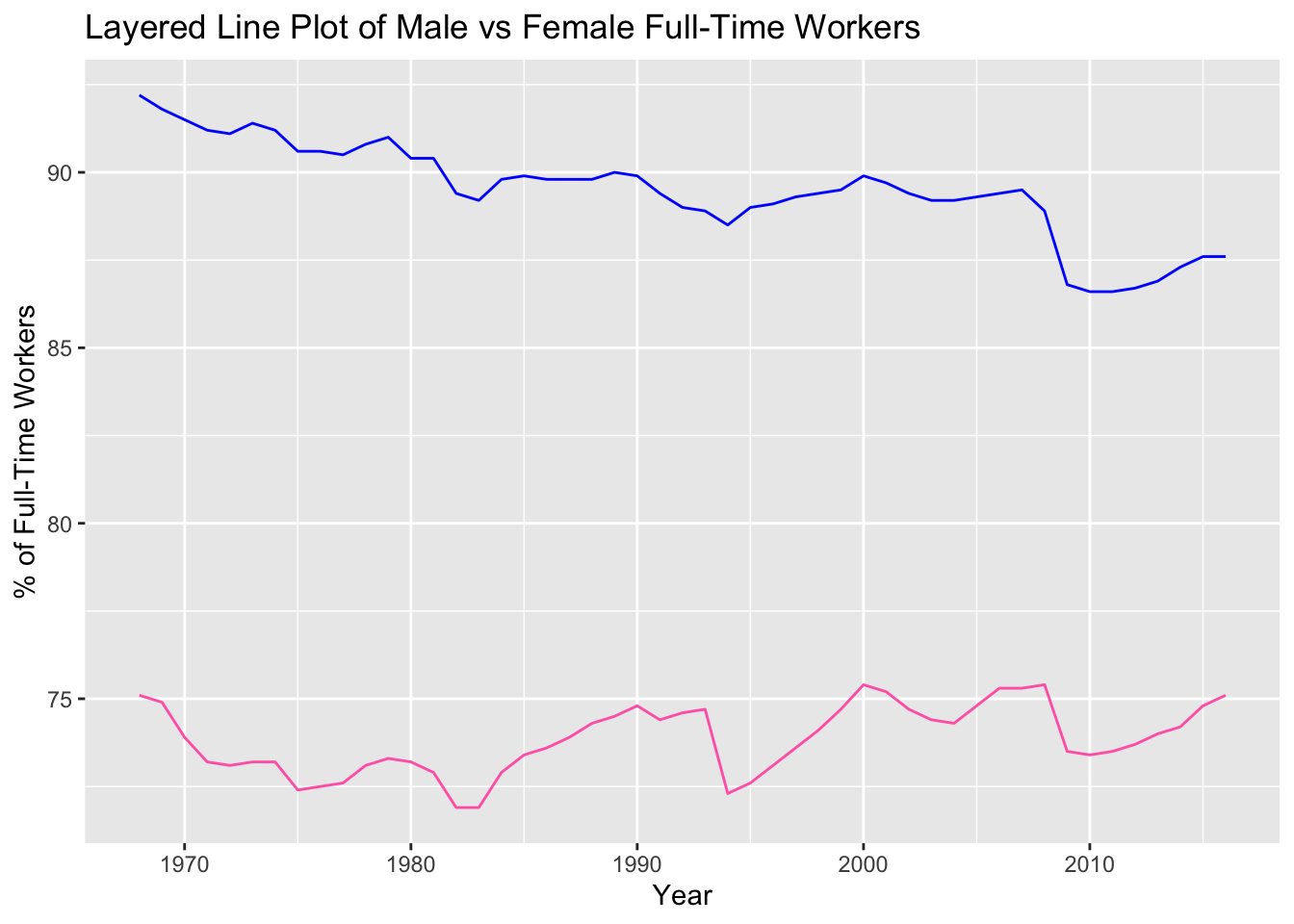
This is an analysis of the ‘Employed Gender’ data set from TidyTuesday. In this project, I depict the relationship between binary sex and percentages of employment in both full-time and part-time positions.
# load in packageslibrary(tidyverse)library(readr)library(dplyr)# read in csv fileemployed_gender <-read.csv("employed_gender.csv")# plot line plots depicting the difference in full-time workers (by gender, by year)ggplot(employed_gender) +geom_line(aes(x = year, y = full_time_female), color ="hotpink") +geom_line(aes(x = year, y = full_time_male), color ="blue") +labs(x ="Year",y ="% of Full-Time Workers",title ="Layered Line Plot of Male vs Female Full-Time Workers" )
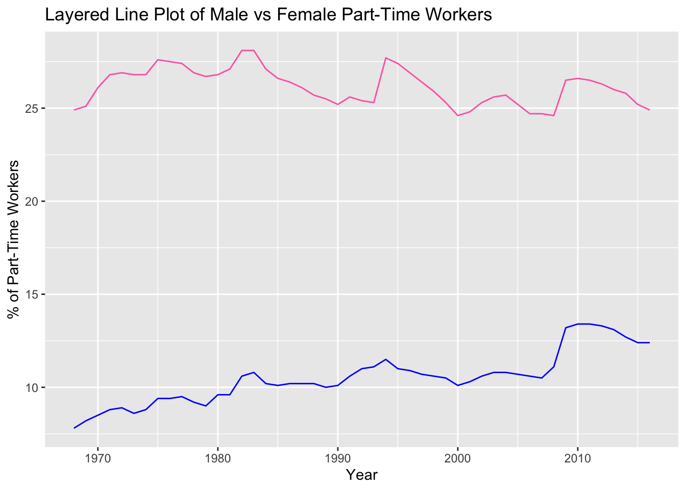
Code for Part-Time Workers
ggplot(employed_gender) +geom_line(aes(x = year, y = part_time_female), color ="hotpink") +geom_line(aes(x = year, y = part_time_male), color ="blue") +labs(x ="Year",y ="% of Part-Time Workers",title ="Layered Line Plot of Male vs Female Part-Time Workers" )
Analysis
The most interesting aspect of these two graphs is the inversion which occurs for the ratio of full-time to part-time work by sex. This is most likely due to the historical struggle for self-identified women in earning and maintaining full-time positions. If I were to continue with this project, I would want to explore the relationship between maternity leave/motherhood and this domination of part-time work for women.
Citation
I retrieved the original csv file from a Tidy Tuesday data set. The raw data originates from the Bureau of Labor Statistics and the Census Bureau about women in the workforce. Jon Harmon, an advanced R programming consultant, then manipulated and divided the data, motivated by March being Women’s History month.